The evolution of websites from the 90s to now!
 https://www.omahamediagroup.com/images/uploads/monster_gallery/Omaha-Media-Group-Black.jpg


From the dial-up ages to now, website design has made drastic changes throughout the past decade! We all remember those starting 90s websites with the terrible font, the GIFs (that weren’t called gifs yet), the terrible colors and all the other bad and memorable design elements.
Fast-forward to now and the design of a website is one of the most important elements to consider when building a website. The evolution of website design might surprise you- how did we go from the 90s to now?
The importance of website design
Research shows that online searchers immediately scrutinized layouts. 94 percent of participants commented on design alone and only six percent on first impression.
The design of your website is a make or break element for your business. At OMG Austin, we understand the importance of website design and we enjoy a simple, clean and easy to use website! This will make you and the customers happy.
The elements of website design that need to be taken into consideration:
- Fonts
- Photography
- Spacing
- Colors
The wrong spacing, color, fonts and other important elements on your website trigger psychological emotions when viewers are looking at it. It’s true, the wrong color could make viewers perceive the wrong notion about your website.
Imagine what emotions were felt looking at these 90s and early 2000s websites! (Yikes!)
90s websites
Websites in the 90s, well, they were different times friends. The websites in the 90s included text documents linked inside the website with a background image behind it to help break up some of that text. We were all learning. Don’t forget about the animation added as well, aka gifs, before gifs were even a thing!
A great example from JustInMind shows the text saturated layouts with no white space or notion of design that is STILL around today! The 90s never left. The website is Arngren.net.

Fast forward to the 2000s and website developers grew leaps and bounds and realized the importance of whitespace and balance! This is when design started to change and a slight notion of designing a website for the best user experience (UX) started to come into notion.
There was a decrease in buyers going to websites that were flashy and super busy- so developers thought of a new plan- a plan to cut down on the flashy aspects and start to use design elements.
A great example of websites from the early 2000s.
 Image from gurl.com
This all changed again from 2003- 2010 when online experience was starting to becoming more about engaging and educating the users. It was no longer about flashy, simple or boring design with no content, the users wanted a little bit of everything.
This is when Web2.0 started and the concept of UX was only expanding more and more.
From 2012 to now, minimalist design and UX is at the forefront of website design elements.
2018 websites
In 2018, the main focus of websites is to grab the users attention, make the website UX and UI friendly and avoid bad website design in general! These are the top website design trends that were set for 2018:
- Broken grid layouts
- Illustration taking the forefront
- More organic shapes
- Interactive animations
- Page transitions
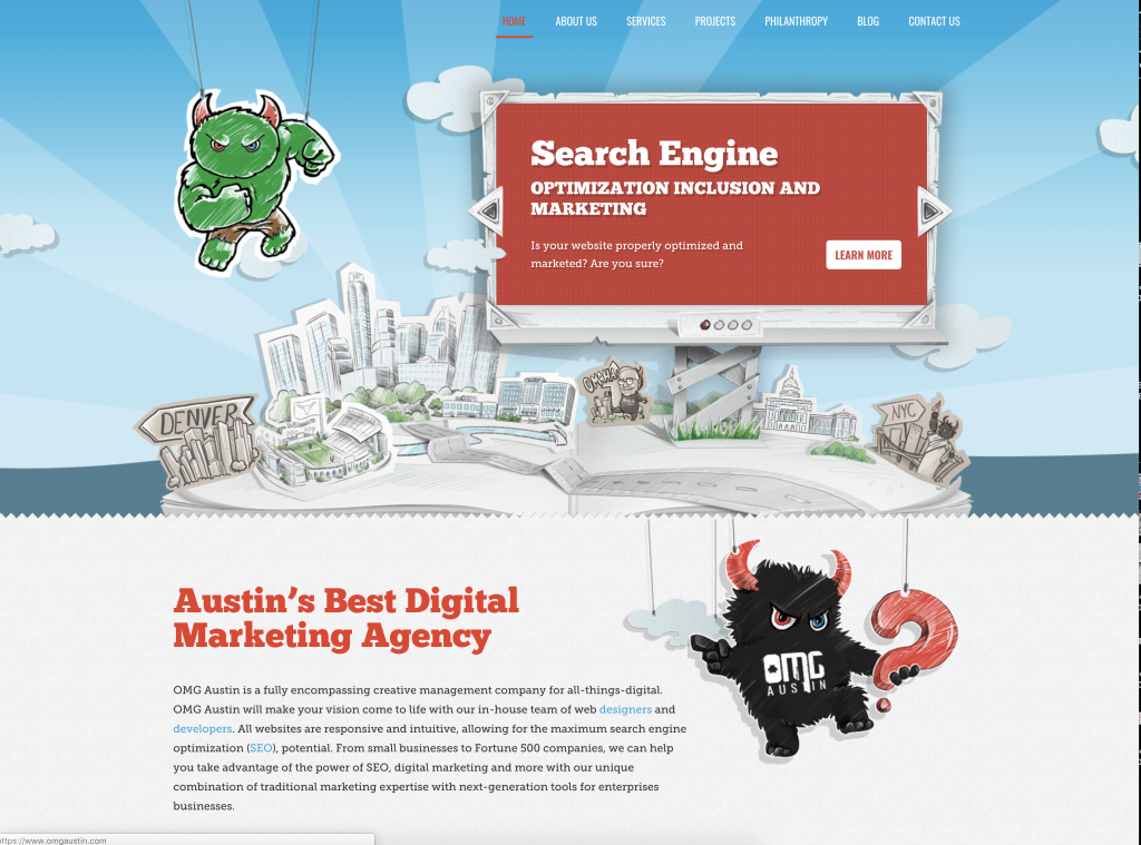
Check out our website for a great example of 2018 design methods!

At OMG Austin, we are the leading website design and development company in the Austin area. Get your website out of the dark ages and bring it to life with our help. For more information, contact us today!
Posted In:
